The new navigation restructure introduces a Settings section that consolidates many of the pages that allow you to make updates to your app configuration. This change also helps you find CallRail features that will assist with your business needs.
What’s new?
Consolidated Settings icon
We want to make sure your experience is as streamlined as possible. The Tracking and Settings links will be consolidated into a new Settings section located on the navigation bar on the left side of the page.

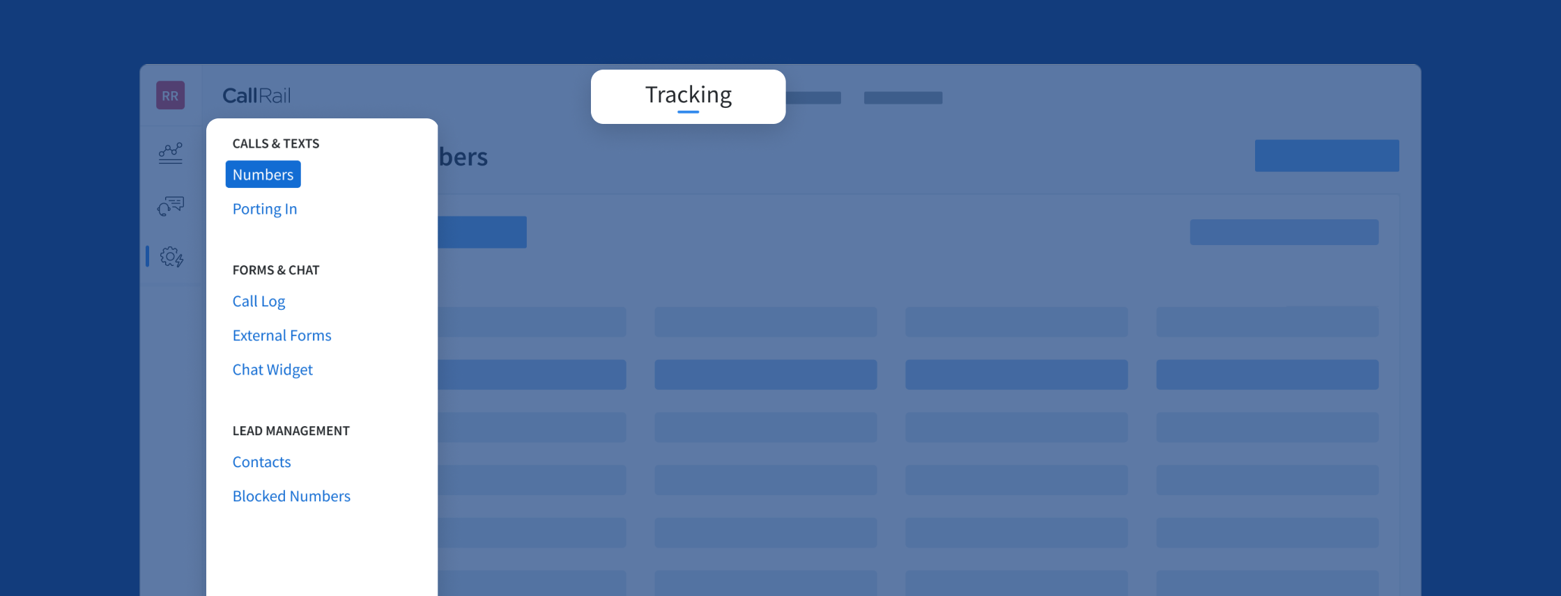
Moving the Tracking page
When you click on the Settings icon, you’ll land on the new Tracking page. We‘ve optimized this page so you can focus on the settings for your numbers, forms, chats, and lead management.
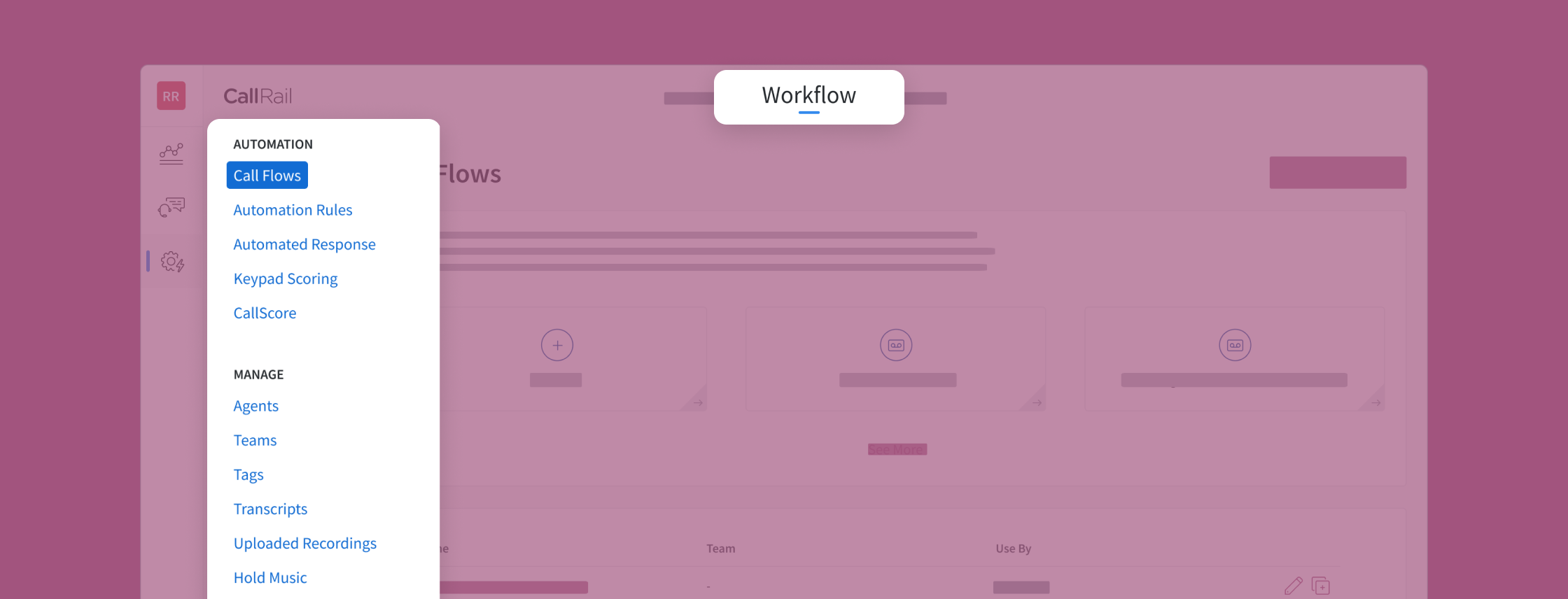
New - Workflow page
Efficiency makes for good business practice. We’ve created a new Workflow page that will enhance your ability to make quick changes to Call Flows, Automation Rules, and more.
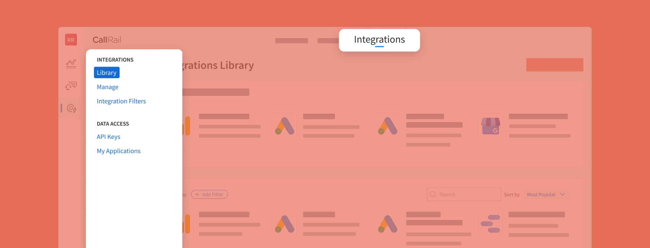
Integrations page
We're happy to announce that Integrations will have its own page for easy access to your vital third-party connections, Integration Filters, and API access.
Why are these changes important?
When we introduced Lead Center as a major feature, we realized we would need some reorganization to maintain structural clarity. We’ve seen feedback from customers that they weren’t aware that other features like Conversation Intelligence and Forms were available. Features they believed would benefit their business.
We had the idea that a single location would improve findability, but we didn’t want to make this decision alone. Our UX Research and Design teams reached out to current CallRail customers to figure out how we could help improve their experience.
The two common sentiments that the teams observed during this period were:
- The navigation took a bit of time to learn
- Customers were not sure they were using all the tools that we offered
To further define their pain points, the teams had the customers take part in a card sorting exercise. Most testers ended up creating a single settings menu that proved to be more intuitive when piloted with a new set of customers. What we ended up with at the end of this process was a reduction of redundancy and a more streamlined experience.
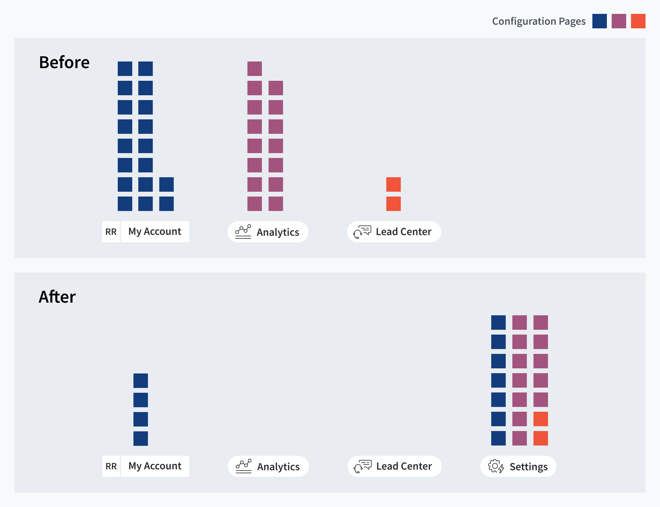
As you may notice in this graphic, we‘ve consolidated pages to make your configurations more accessible and intuitive for everyone. And we’ll keep striving for the best possible user experience as CallRail continues to grow.